PIVOT
(Click on images for larger version)
Plots shown here are generated using data from Dueck, Hannah, et al. "Deep sequencing reveals cell-type-specific patterns of single-cell transcriptome variation." Genome Biol 16 (2015): 122, and data from Risso, Davide, et al. "Normalization of RNA-seq data using factor analysis of control genes or samples." Nature biotechnology 32.9 (2014): 896-902.
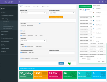
File Panel: PIVOT supports input of data folder, count matrix and PIVOT states. It allows the user to filter or subset the data based on various criteria. Users can upload group/batch information for differential expression analysis. It is also possible to save and load the program state using the system control panel.
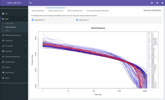
Rank-Frequency Plot: A plot showing rank-ordered frequency distribution of expressed genes in all samples.
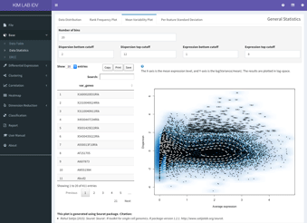
Mean-Variability Plot: A plot generated by Seurat package (http://www.satijalab.org/seurat-intro.html) for the identification of variably expressed genes.
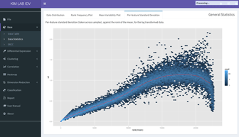
Rank-Sd plot: A plot generated by vsn package for the visual verification of whether there is a dependence of the standard deviation on the mean.
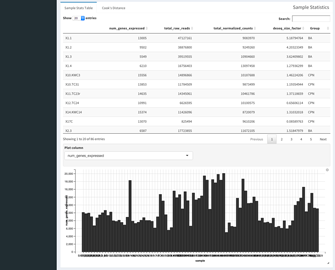
Sample Statistics Table: Quick view of the basic sample statistics, including number of genes expressed, total raw counts, total normalized counts, estimated library size factor and group information. It is helpful for the identification of abnormal samples.
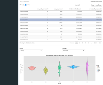
Feature Statistics Table: Quick view of the basic feature statistics, including number of cells expressed, percent cells expressed, total raw counts and total normalized counts. It is useful for the filtering of low expressed features. The user can click any features in the table and get the expression plot across samples/groups.
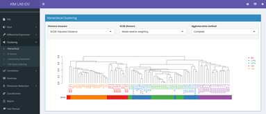
Hierarchical Clustering: Users can choose different distance measure and agglomeration method to be used for hierarchical clustering. A color bar can be added to show sample grouping.
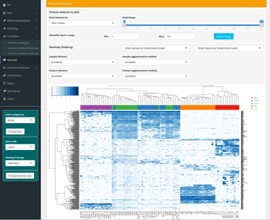
Feature Heatmap: The feature heatmap module provides visualization of the expression pattern as well as feature-wise and sample-wise hierarchical clustering result. The d3heatmap package allow the user to zoom in on any part of the heatmap.
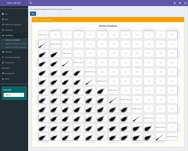
Sample Pairwise Correlation: A matrix of scatterplot showing the correlation between samples.
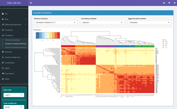
Sample Correlation Heatmap: A heatmap showing the correlations between samples with hierarchical clustering based on the correlation distance.
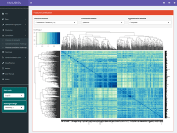
Feature Correlation Heatmap: A heatmap showing the correlations between features with hierarchical clustering based on the correlation distance.
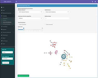
Minimum Spanning Tree and Community Detection: A minimum spanning tree based on user-specified cell distance measure. Community detection can be performed on this tree graph using the walktrap algorithm.
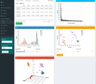
Principal Component Analysis: This panel shows the 1D, 2D and a rotatable 3D PCA projection plot, as well as the scree plot and related tables. The user can choose the principal component to be plotted on each axis, and get sample name by simply mouse over the points.
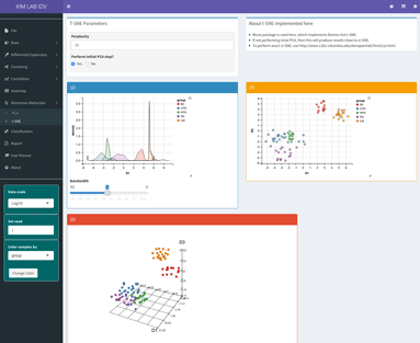
T-SNE: The Barnes-Hut t-SNE result shown in 1D, 2D and 3D plot.
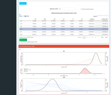
SCDE Differential Expression Analysis: The differential expression analysis by the SCDE package (http://hms-dbmi.github.io/scde/diffexp.html) can be easily performed in PIVOT. The user can click any gene in the result table to view its estimated expression posteriors. The SCDE adjusted distance can also be computed and be used for clustering analysis.
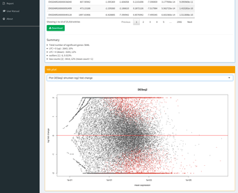
DESeq Differential Expression Analysis: The differential expression analysis by the DESeq2 package (https://bioconductor.org/packages/release/bioc/html/DESeq2.html) can be easily performed in PIVOT. The MA-plot shows the log2 fold changes of each feature, and the red points represent features with significant expression variation.
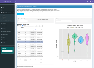
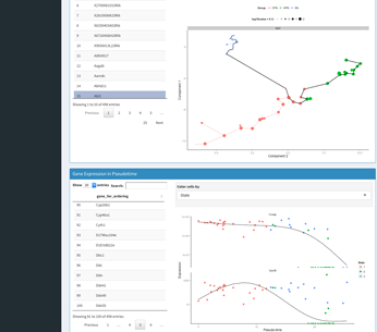
Monocle DE Analysis and Cell State Ordering: The differential expression analysis by the Monocle package (http://cole-trapnell-lab.github.io/monocle-release/) can be easily performed in PIVOT. The user can check the expression pattern of every gene in the result list and use this list for monocle cell state ordering.
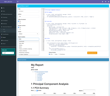
Report the Analysis: Users can generate report by simply choosing which modules to add. PIVOT will automatically capture the last state of each analysis modules as well as user-specified parameters. Users can also modify the report using Rmarkdown language.
